New & Notable
Top Webinar
DSC Webinar Series: How to Scale NiFi Deployments to Enable Universal Data Distribution
Ben Cole | August 29, 2023 at 3:08 pmRecently Added
DSC Weekly 23 April 2024
Scott Thompson | April 23, 2024 at 2:29 pmAnnouncements Top Stories In-Depth...
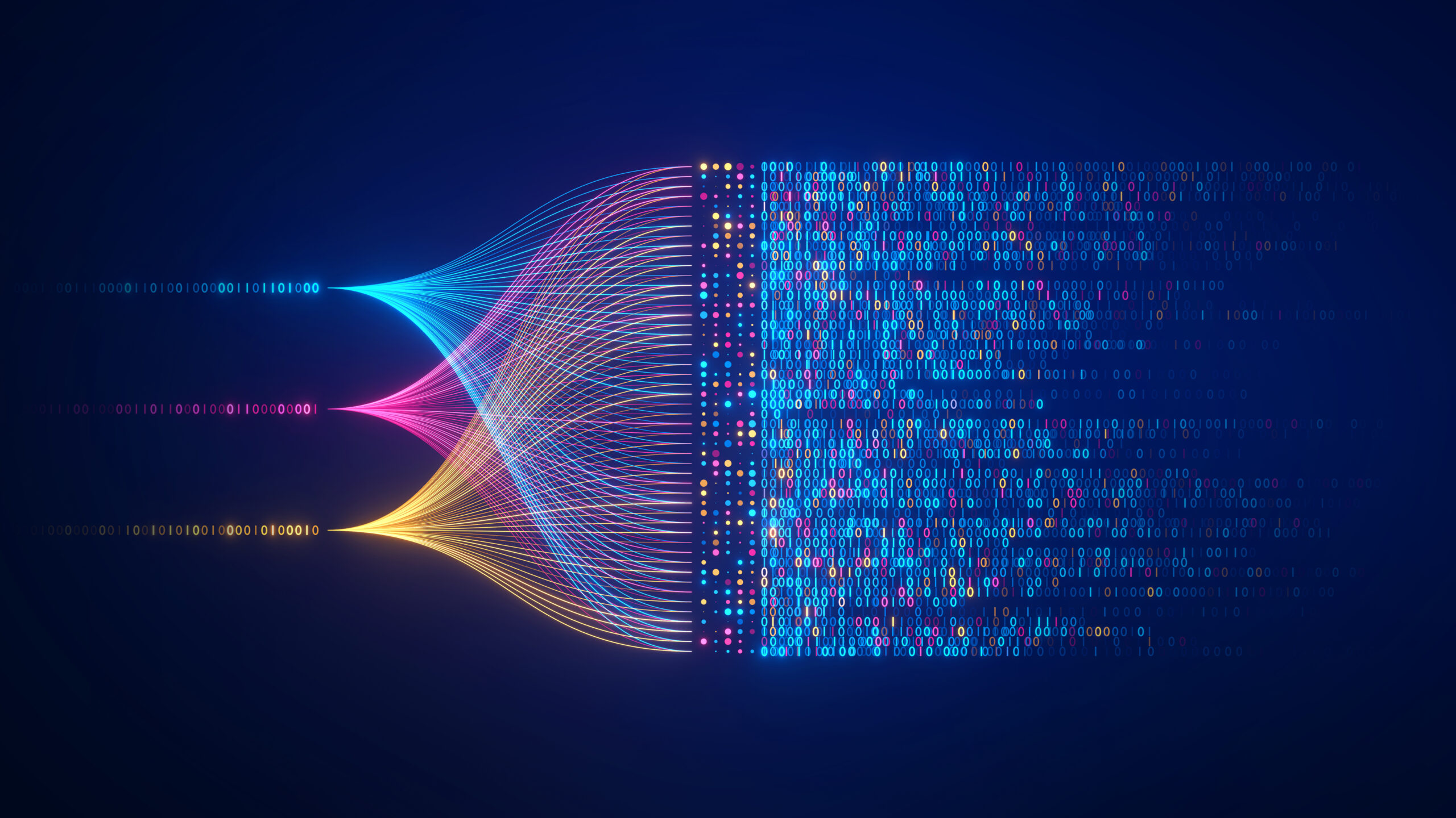
How to implement big data for your company
Yana Ihnatchyck | April 23, 2024 at 10:50 amBig data analytics empowers organizations to get valuable insights from vast and intricate data sets, offering a pathway...
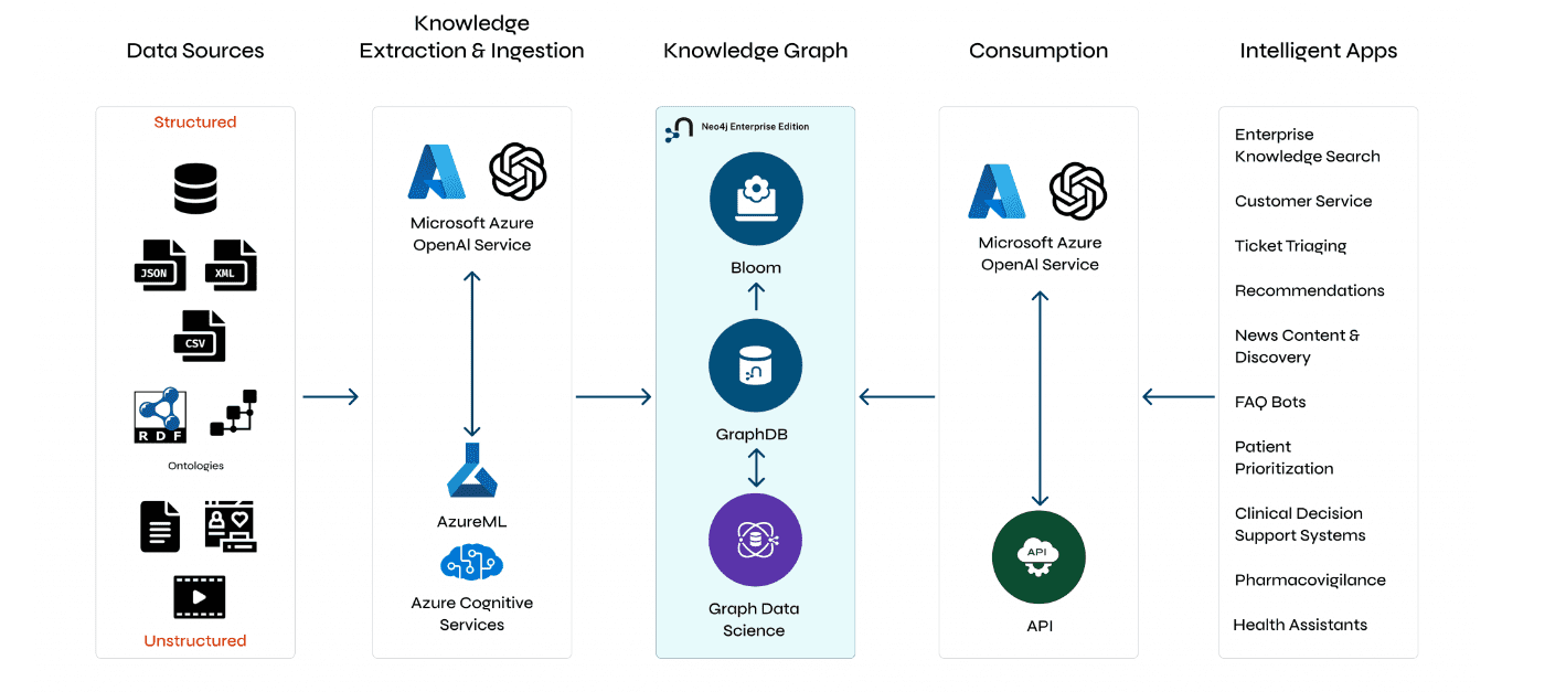
Understanding GraphRAG – 2 addressing the limitations of RAG
ajitjaokar | April 22, 2024 at 4:08 pmBackground We follow on from the last post and explore the limitations of RAG and how you can overcome these limitations...

How predictive analytics improves payment fraud detection
Zachary Amos | April 22, 2024 at 3:09 pmPayment fraud is a significant issue for banks, customers, government agencies and others. However, advanced predictive ...
Understanding GraphRAG – 3 Implementing a GraphRAG solution
ajitjaokar | April 22, 2024 at 10:59 amIn this third part of the solution, we discuss how to implement a GraphRAG. This implementation needs an understanding o...
Quantization and LLMs – Condensing models to manageable sizes
Kevin Vu | April 19, 2024 at 3:39 pmThe scale and complexity of LLMs The incredible abilities of LLMs are powered by their vast neural networks which are ma...
Diffusion and denoising – Explaining text-to-image generative AI
Kevin Vu | April 19, 2024 at 10:23 amThe concept of diffusion Denoising diffusion models are trained to pull patterns out of noise, to generate a desirable i...

How data impacts the digitalization of industries
Jane Marsh | April 18, 2024 at 1:39 pmSince data varies from industry to industry, its impact on digitalization efforts differs widely — a utilization strat...
DSC Weekly 16 April 2024
Scott Thompson | April 16, 2024 at 1:38 pmAnnouncements Top Stories In-Depth...

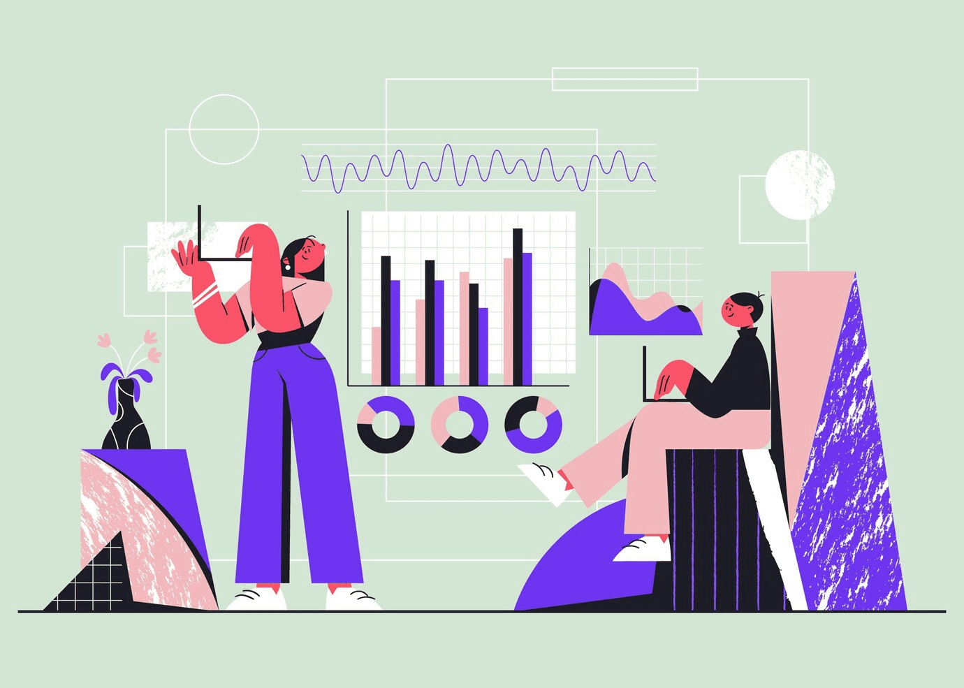
Using window functions for advanced data analysis
Erika Balla | April 15, 2024 at 1:53 pmWindow functions are an advanced feature of SQL that provides powerful tools for detailed data analysis and manipulation...
New Videos
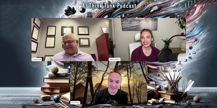
Implementing AI in K-12 education
Roundtable Discussion with Rebecca Bultsma and Ahmad Jawad In the latest episode of the AI Think Tank Podcast, we ventured into the rapidly evolving intersection…
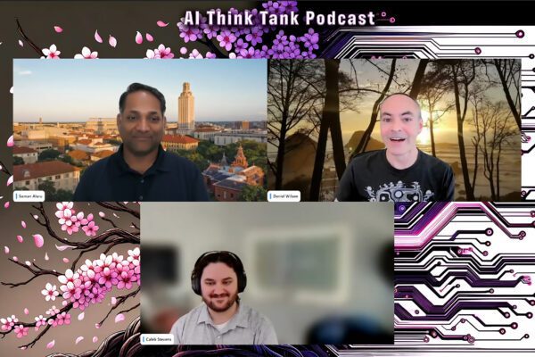
Retrieval augmented fine-tuning and data integrations
Presentation and discussion with Suman Aluru and Caleb Stevens In the latest episode of the “AI Think Tank Podcast,” I had the pleasure of hosting…
7 GenAI & ML Concepts Explained in 1-Min Data Videos
Not your typical videos: it’s not someone talking, it’s the data itself that “talks”. More precisely, data animations that serve as 60-seconds tutorials. I selected…